The purpose of this challenge is to compare the black and white photo to the coloured version. So, just for fun, here’s my contribution.
Apples have to be red. Sweet and juicy. But red, most definitely red.

Not green. It’s just wrong, in oh so many ways..

And black and white leave a lot to be desired.

But seriously.
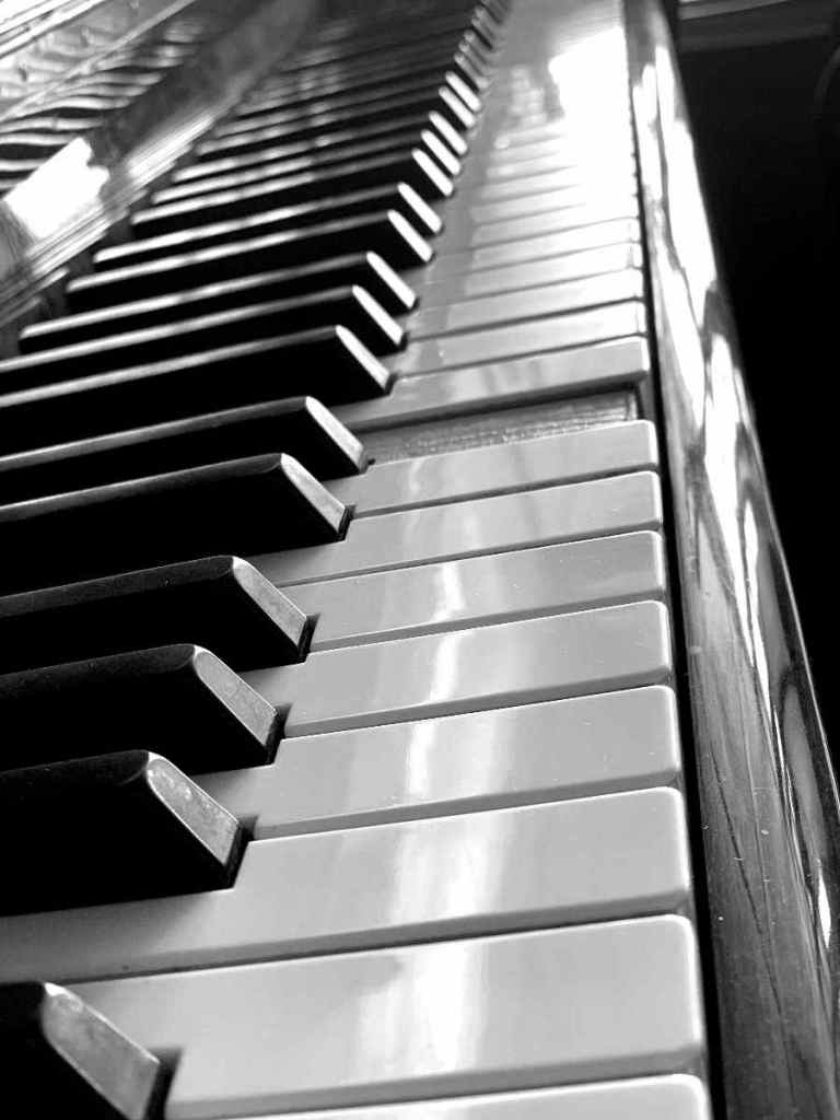
Pianos by their very nature would be odd if they were anything but black and white. However, I’m leaning towards the coloured version of this photo. The piano is old, a single key is missing. The ivory (or plastic in this case) has naturally turned to cream. The ebony (also plastic) is starting to fade. The shades of brown tone in to emphasize the cream. It’s mellow. The feeling is one of warmth and love for the aged instrument.

The black and white version works for me too. I keep changing my preference here every time I reexamine the photos. I really like the reflections and interplay of light in the black and white. The missing key stand out starkly, making the same visual point, maybe with even more emphasis. Thus it shows the age, by the state of repair, not by the more emotive colouring.

The apples work much better in colour!
LikeLike
Absolutely. Thanks
LikeLike